
Self-service

PROBLEM
Since Wambi was a small startup company, any time one of our large clients requested an update to their system, our company would have to designate time to manually overriding things on the backend. Simple things like updating the employee list, changing imagery shown on the newsfeed, or updating rotating challenges in the platform became a time consuming task, and it wasn’t exactly pretty. Things were managed on a clunky, thrown-together interface with lots of buttons and terminology that wouldn’t make sense to any of our clients; it hardly made any sense to most of us on the product team.
Objective
We needed a way for our customers’ system managers to take full control over the system they were paying to use, in an easy to digest and seamless experience. The things we needed to design for were Users, which were the people who exist in the Wambi database — past, present, and future. There was a ton of data that needed to be displayed between these three statuses, so we had to figure out what information was most important for a manager to get different tasks done.
Before this project began, we already had a Management Hub that existed for certain members in our platform who had higher ranking-permissions. We had to squeeze lots of different user data around the existing UI while keeping in mind of our userbase’s computer limitations. Scrolling vertically would not be a familiar interaction for them.

Solution
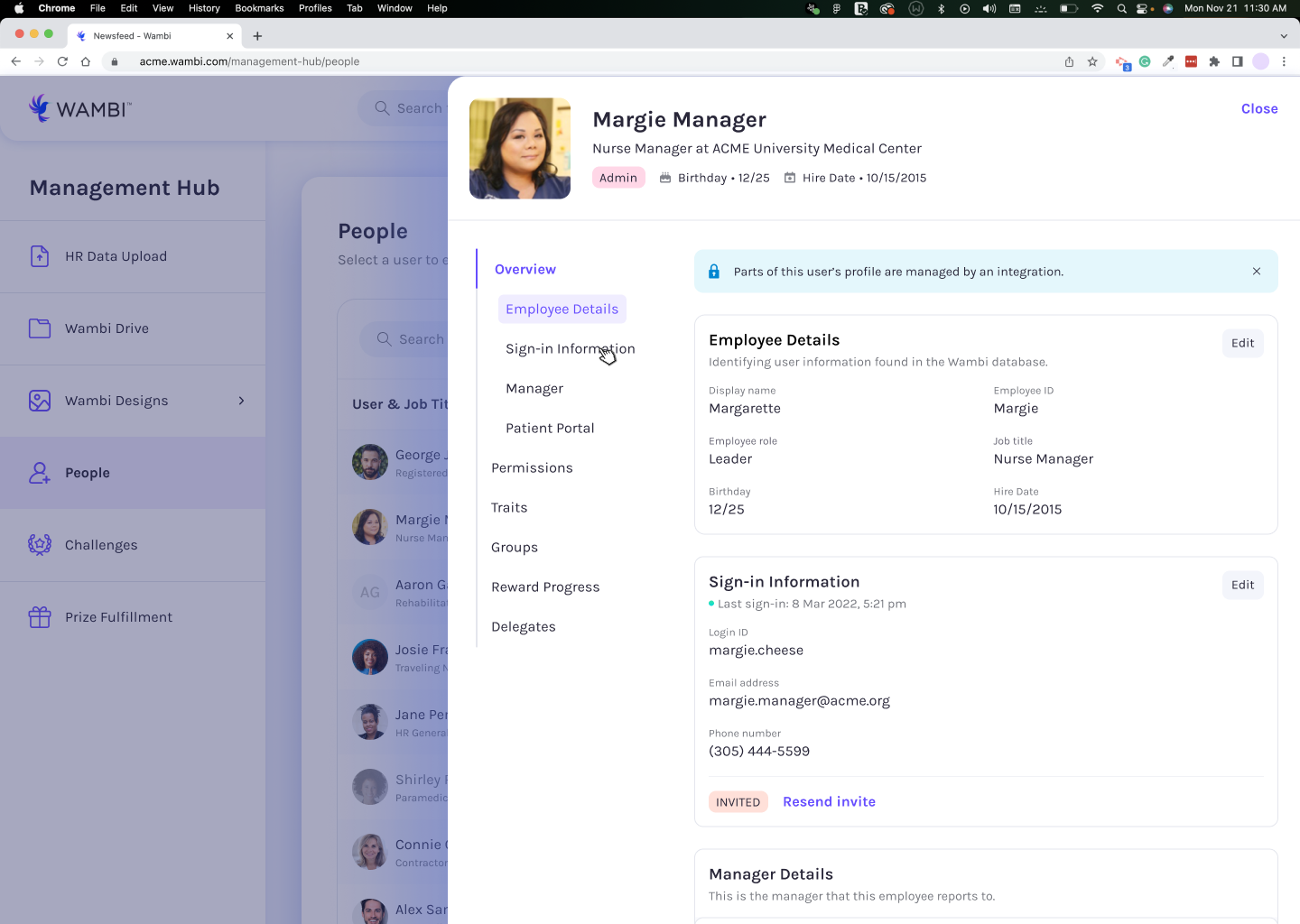
We knew the People table would require the standard information at a glance: Name, Job title, Location, and Employee ID. Additionally, our client managers would need to see whether or not a user was deactivated, what type of role they served at the hospital, and who they reported to. Furthermore, we would need to know if a user was findable by a patient, and how to contact that user. There was much more information to include about our users, but that was nested behind a selected state.
I created a solution that allowed a user to both see the table and the user they selected, so that they were able to refer to what they were doing previously and not be confused by the change in view. There’s a ton of information to look at, so limiting confusion and change is key to successful information architecture.
There were also a multitude of states to consider, and how to get that information across. We icons when we didn’t have room to squeeze explanation text, which were accompanied by hover states with further details about what an icon might mean.

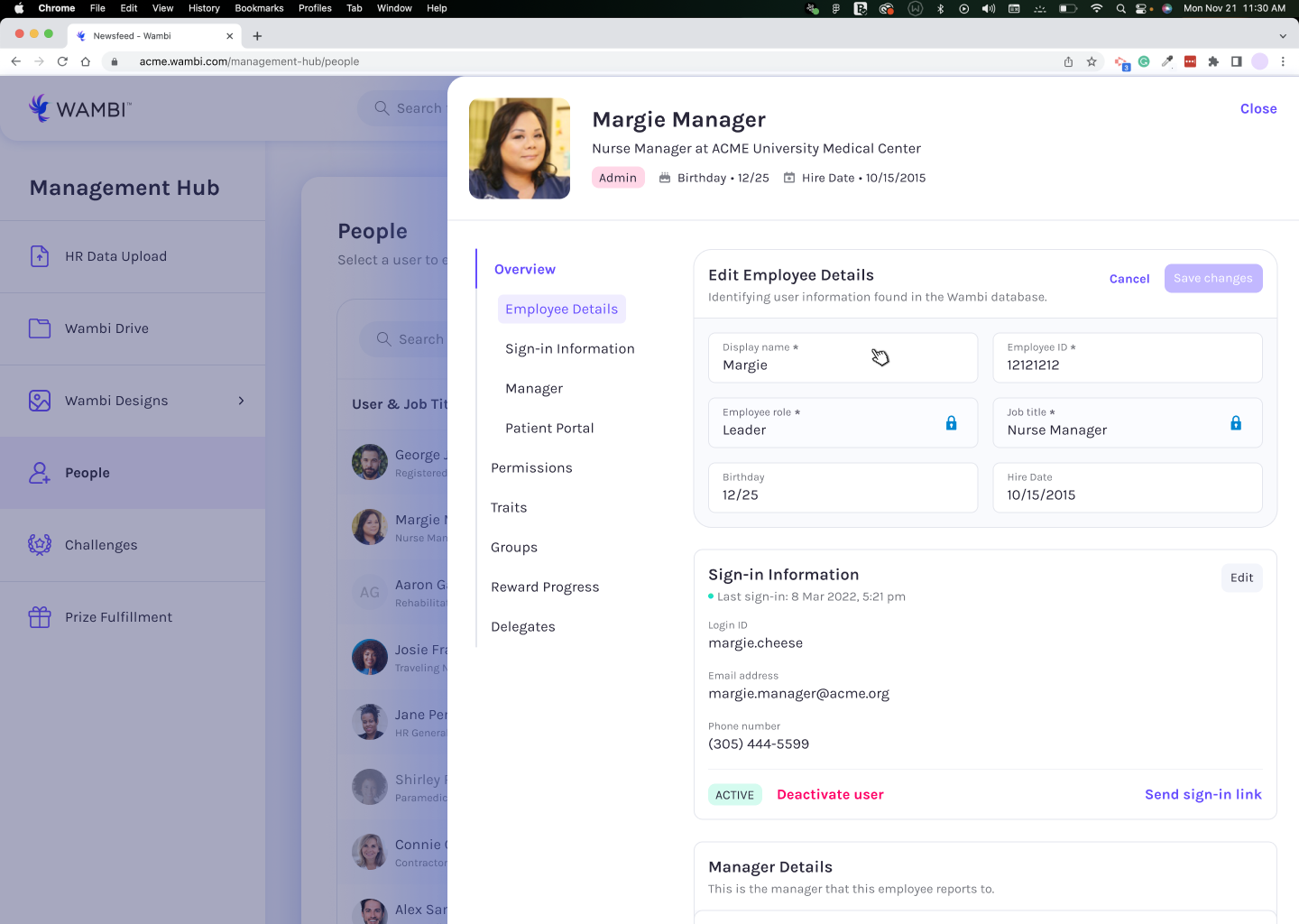
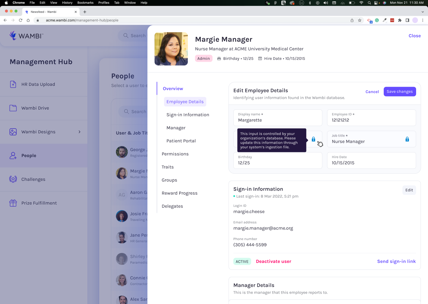
There were different elements that affected a client manager to be able to complete a task, such as the current state of the user, whether or not client ingestion interacted with a user’s information (and therefor could not be changed), and whether or not a user has the correct security access to be granted different abilities.
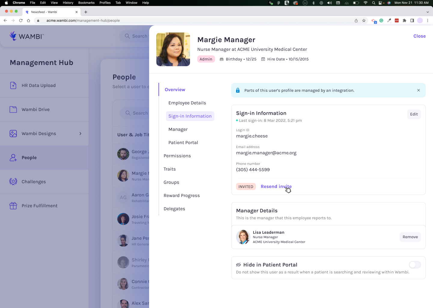

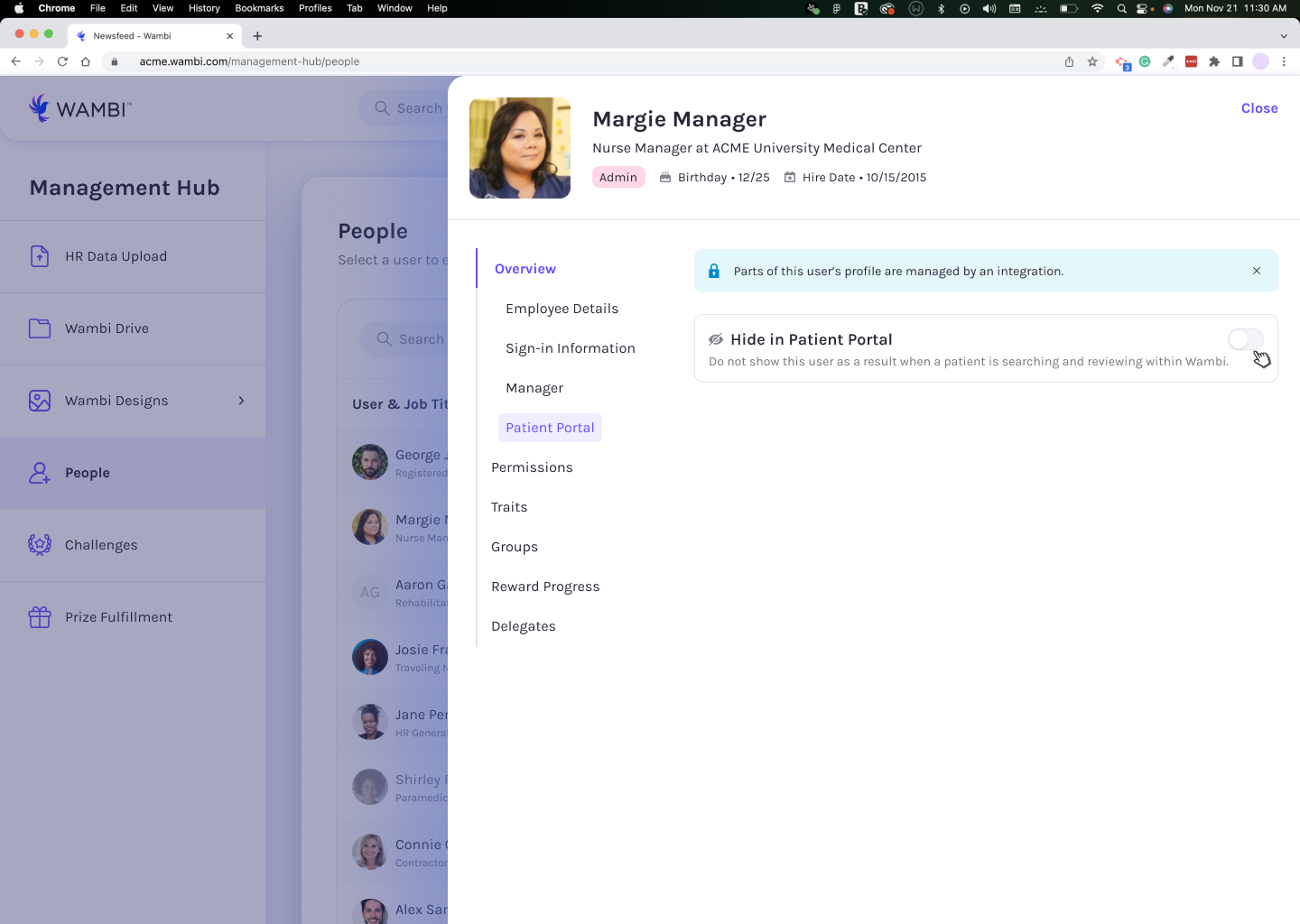
To further prevent confusion, we also added a left navigation that updated as a user scrolled, so that a user can see all information that relates to the section they might be looking for.
There were lots of different settings we had to include in this feature, all of which would vary depending on each client and the package they purchased. We had to make sure that things were easy to understand when creating these different settings, because a client manager may not remember all the context that was shared in our training course, and needs to better understand any type of consequences that may come from making a misstep in their process.


